We had a request to customise the default Experience Analytics dashboard on a Sitecore 8.1 site. With a little guidance from Sitecore we have been able to do this easily without development, but it is a bit of a convoluted process so I thought I would outline it here.
If possible, get your site live with Analytics configured correctly and capturing data well before you start looking at customising it, as you can then browse around the default analytics pages and see the real data that is captured. You can then give an analyst access and ask them what changes would be useful.
The default dashboard looks a little like this, on a site that hasn’t had any Analytics customisation done:
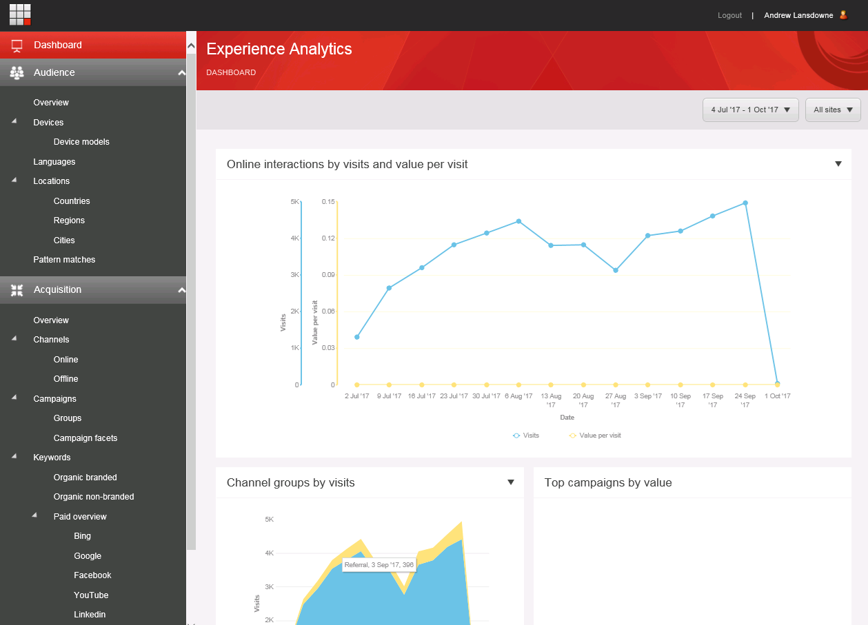
All the blocks apart from are ‘by value’ which means there is no data because no profiles / personas / experience scoring has been configured. Therefore, our analyst asked if the dashboard could be changed to include more common analytics like you might find on a Google Analytics dashboard.
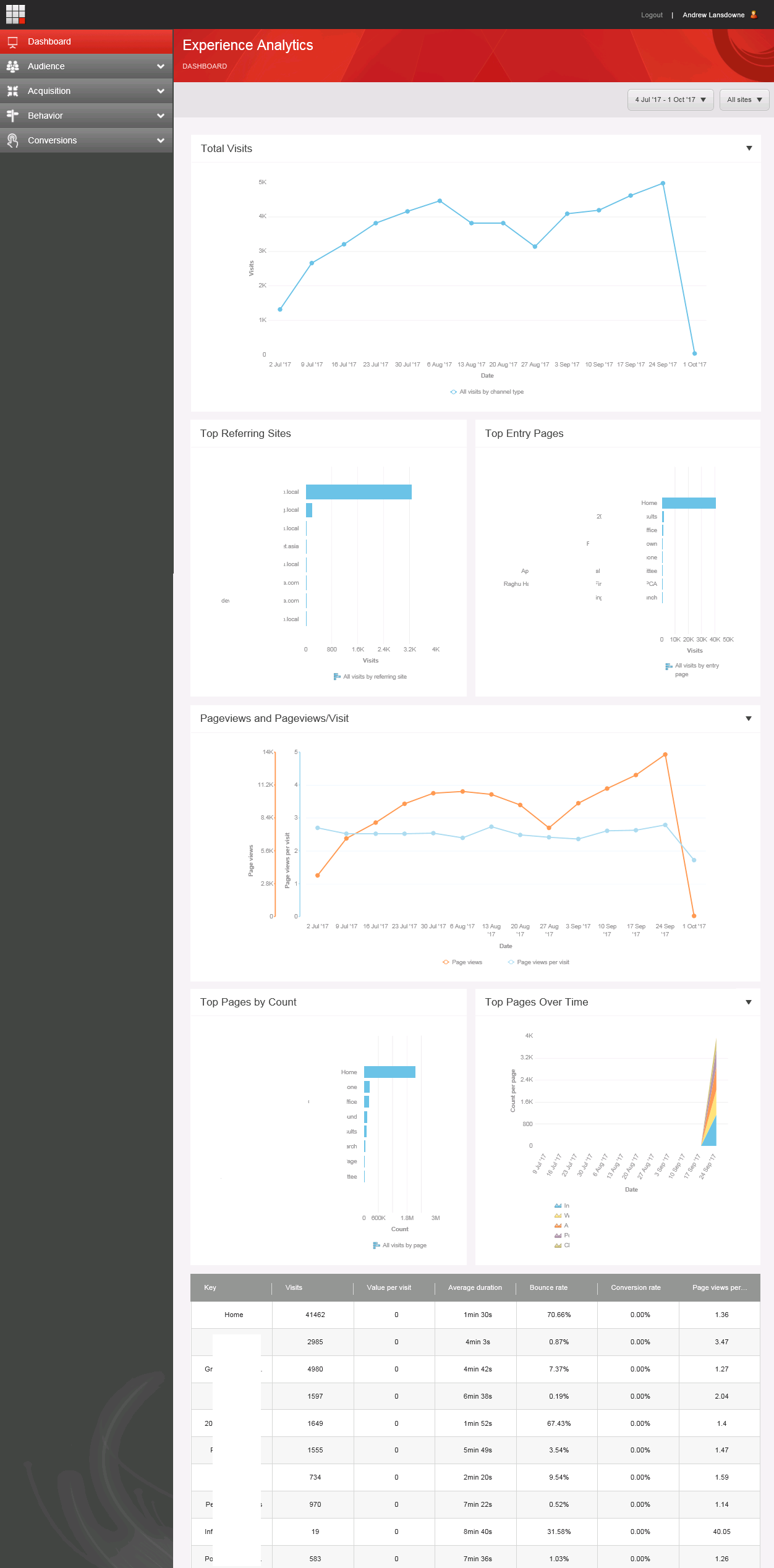
- Total Visits (line chart)
- Top Referring Site (bar graph)
- Top Entry Pages (bar graph)
- Pageviews + Pageview/Visit (line chart)
- Top pages (bar chart)
- Top pages over time (line chart)
- Top 10 pages (table)
These are all graphs that she found in other Analytics report pages, so all we had to do is figure out how to remove the existing charts from the dashboard and copy these from the other pages, creating a new dashboard layout.
The most relevant Sitecore documentation discusses how to create a new report page with a single chart. Using this and a bit of Sitecore knowledge you can figure out how to edit an existing complex dashboard.
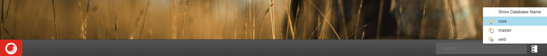
The analytics reports structure is stored as Sitecore items in the core database. You can view it by using Sitecore Desktop (link from the Sitecore launchpad) and switch to Core DB using the link at the bottom right:
Then open Content Editor and browse to /sitecore/client/Applications/ExperienceAnalytics/Dashboard
You can see that beneath Dashboard are all the report folders (Audience, Behaviour, etc – which are just common Folders) and report pages (Overview, Devices, etc – using template /sitecore/client/Speak/Templates/Pages/Speak-DashboardPage)
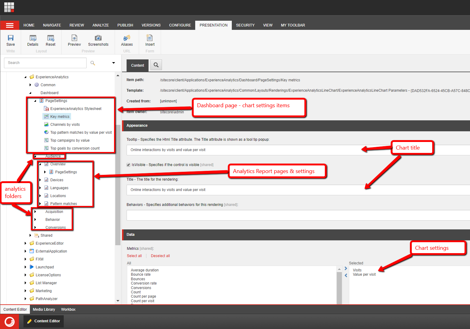
Each report page has a PageSettings folder (template = /sitecore/client/Speak/Templates/Pages/PageSettings) that contains an item underneath it for every chart on the page. These items allow you to set the chart title and any other settings such as which metrics / dimensions to use on the chart.
Review the Layout Details for any page with multiple charts and you can see it is made up of a series of Rows and Columns which define the page layout, and renderings for each chart.
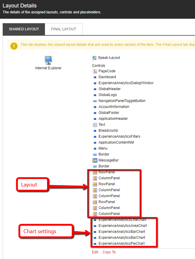
Click Edit and you can see the placeholder IDs used – now you can see how the page is put together. RowPanels are rendered one above the other (in Main.Content placeholder) and each RowPanel automatically defines a placeholder “RowPanel X.Content” where X is the row number. Then ColumnPanels are inserted into the RowPanel placeholders to set up however many columns you want to break that row into. In this example, one full width row, then two 50/50 rows.
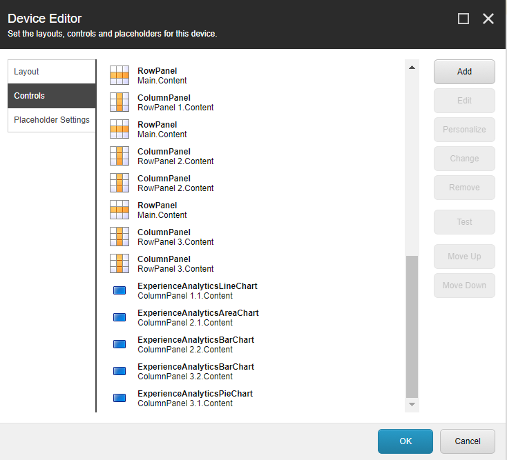
The chart renderings themselves are inserted into the ColumnPanels using autogenerated placeholders based on the row and column number e.g. “ColumnPanel 3.2.Content” means this rendering will be shown in row 3 column 2.
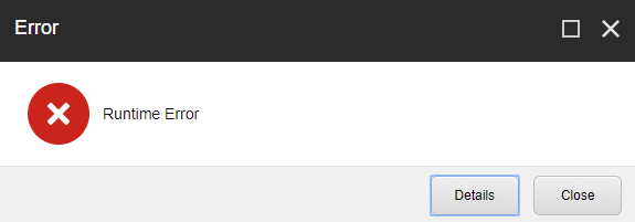
To edit this becomes more interesting because you can’t simply edit this in Sitecore – Edit gives you a server error, and Change gives you an empty list of renderings:
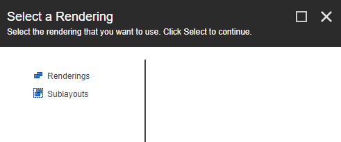
So based on the Sitecore article we have to switch to Sitecore Rocks which is able to edit these. Install and connect to the Sitecore instance, then expand Core database to the same location. Select a report page, Right-click, Tasks, Design Layout:
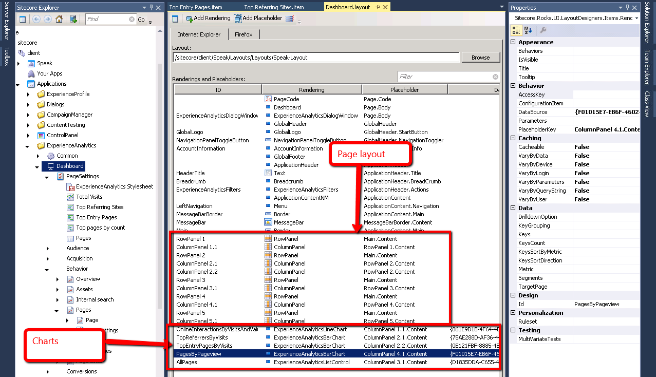
Now you can edit the configuration of rows/columns by moving/adding/removing RowPanel and ColumnPanels, editing the Placeholder of each. Note that each ColumnPanel has a ‘GridColumns’ field set to 12 for full width, 6 for half width, 4 for 1/3 width, etc. Each RowPanel seems to be used for a single Row, not floating multiple charts into it.
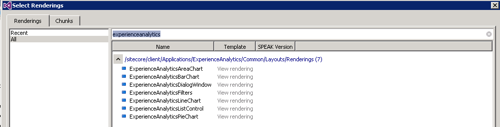
The charts themselves use one of a number of Renderings all starting with ‘ExperienceAnalytics’ – you can copy/paste these using right click options from one page’s layout to another, or Add Rendering to pick one to add from scratch:
Each chart needs to have its Datasource set to a PageSettings child item using the matching parameters template:
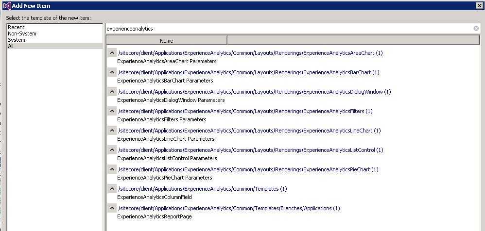
Easiest is to find and copy the existing settings item from another report page, under the dashboard page, and then edit the datasource of the chart rendering item to use the new settings item.
Save regularly and reload the dashboard page, to see your changes. Here is my modified dashboard page where I have different charts:
This post is is gold, but I can’t believe how long-winded dashboard setup is. Thanks for writing it up.