If you have a normal Link field which you render using an <sc:link /> control then you can select the link in a nice friendly way when editing through the Page Editor.
However if you have a custom css class to style your link then you might expect the link field to use that style in edit mode. Here’s an example link and the HTML we want it to render:

<a class="arrow-link" href="/">Read more</a>
However, when converted into an <sc:Link CssClass=”arrow-link” /> this is what Sitecore renders during edit mode, when you haven’t yet set a link:


Note that this doesn’t include an <a> tag at all. However, it does include the CSS class, albeit encoded into the sc_parameters attribute of the <code> element.
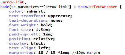
To make it styled-up using the same CSS class I added to the CSS an additional selector for the style:

So now as well as the .arrow-link class applying to actual .arrow-links, it also applies itself to Sitecore’s scTextWrapper span (which is where the [No text in field] is rendered). Now, before you fill it in, it looks like this:

Nice. This really helps if you have lots of similar-looking fields (e.g. Text, Links, etc) all below each other, as the editor can see which is meant for which. I would like to see if anyone has a nicer way of doing this by extending Sitecore, but I thought doing it in CSS would be a simple workaround.
A very useful post.. Thanx for taking time to share the information…